Winning Books
Feng-Ling Liu
Design Concept:
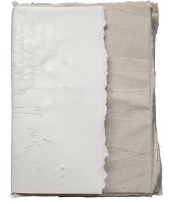
The album “Invisible Writing” presents a form of fusing artwork with contexts and introducing contexts with artworks. The inner pages are made up of various papers, random thin threads inserted amidst. Different types of papers interweave as if the multiple textures of mediums in the artist’s works. The cover page comprises hand-torn paper processed with repetitive hot foil stamping, a printing method of a destructive nature, which creates indentation marks like traces in the snow and allows the transparency of light to travel through the flowing lines of characters. Physical silver threads secretly stitched to part of words within pages would gradually reveal whilst readers pore over the album.
Feng-Ling Liu
Author:Feng-Ling Liu
Editor:Feng-Ling Liu
Illustrator/Photographer:Feng-Ling Liu
W x H cm/pages:19x26cm/160
ISBN:9789860697346
Contact:Feng-Ling Liu
E-mail:fengling1109@gmail.com
Winsing Arts Foundation
Design Concept:
The work is adapted from the novel “The Picture of Dorian Gray” by Oscar Wilde, using the book title “Du Lian Kui” to present different arrangements, from the initial elegant state, moving to form a combination of a hideous face, to the final collapse, trying to use the font arrangement to match the key twists and turns in the story.
Author:Wang Da-Hong
Editor:Shyu Ming-Song, Ni An-Yu
Illustrator/Photographer:Wang Zhi-Hong
W x H cm/pages:16.4×23.5cm/256
ISBN:9789579057998
Contact:Wang Zhi-Hong
E-mail:info@wangzhihong.com
Chi Ming Publishing Company
Design Concept:
The pencil and the eraser take turns acting as a paintbrush, smearing on each other repeatedly, in a self-indulgent manner, jumping between existence and disappearance, until that moment comes when words and strokes, and all the sentiments have become traces that resist being returned to the whiteness of paper…The round lollipop as the main visual sign and the structural center, other than literally translating the theme of candy from the book title, hangs up there like a head, with the surrounding decorations appearing to be a young girl’s hair at first glance, while the radiating and spiral pattern at the center of the lollipop represents a black hole that swallows itself. Both the book jacket and the belt adopt fluorescent colors of purple and green, meant to convey a magic and surreal atmosphere of the story.
SiLoo Story
Design Concept:
“Practicing Goodbye” is Bei Lynn’s first graphic novel which tells a story of the sudden disappearance of the loved one through the separation and reunion of the main character and the dog, Bibi.
This book is divided into six chapters which are purely hand-drawn with pencils. The traces and marks of repeatedly smearing and covering are deliberately and intentionally retained to convey the concept of that disappearance is also a kind of existence. The colors are slowly added in the last chapter, superimposed layer by layer, page by page, as if the main character’s state of mind becomes brighter and brighter.
In the design process, the rhythm of reading is considered, so some pages are left blank; some texts and images are separated. The second chapter is an imagined journey during the disappearance of the dog. To distinguish the perspective, the differences between paper and printing is made. In addition to the visual differences, the tactile feeling during turning the book is also taken care of.
The story ends with a photo of the dog and a baseball in an untidy style. It represents that the author is playing with him for the last time. It is a practice of saying goodbye.
Author:Bei Lynn
Editor:Ming-Mei Kao
Illustrator/Photographer:Bei Lynn
W x H cm/pages:16x23cm/156
ISBN:9786269565238
Contact:Ming-Mei Kao
E-mail:siloo1224@gmail.com
DIANCAN ART & COLLECTION LTD.
Design Concept:
“Hell + ” Design Description
1. The cover borrows the form of poking lottery to “lifelike” or even “gamify” hell, pull out the existing horror experience, and add the concept of transformational justice, using the incense of these temples, the materials and decorative patterns of persuading the world murals , to deepen the reader’s imagination of the hell space, and the Polaroid in the book is almost presented in the original size, which strengthens the sense of real record.
2. The inner cover is made of double-sided golden cardboard, and the thickness is brushed with gold, making the whole book like a gold nugget. The magenta book jacket wraps the gold nugget—seal up the gold—and seal up the hell with the gold.
3. The eight front and back title pages are black-backed and gold-backed, using the theme of “Shining in the Sunshine” as a reading cutscene. The monochromatic black inside the jacket symbolizes the shadows.
4. The mantra of Ksitigarbha Bodhisattva is arranged at the opening and the end of the coloring page, and the mantra at the end is left and right reversed, symbolizing the vow and cycle of hell.
5. In p.1, p.64, and p.232, three long spell inserts are arranged to adjust the sense of stability and order of the whole book.
6. Four-fifths of the book are framed in gold color pages, and one-fifth of the paper is presented in monochrome, turning the realistic documentary sense of images into abstraction, expressing the author’s view of hell in writing.
Author:Yao Jui-Chung
Editor:Allie Lien
Illustrator / Photographer:Yao Jui-Chung
W x H cm/pages:21×14.8cm/264
ISBN:9789860681215
Contact:Amy Chen
E-mail:amychen@artouch.com
Taipei Fine Arts Museum
Design Concept:
The catalogue design draws inspiration from Stanley Kubrick’s 1968 sci-fi film, 2001: A Space Odyssey. Using black paper, the entire book evokes the impression of a stone slab, and brings to mind the black obelisk erecting on the surface of the moon. Conveying the imagination of a boundless cosmic space, as well as humanity’s awe of and longing for the unknown world/technology, the design works as a lead-in to introduce the exhibition theme: “Cosmotechnics After the Space Race,” “Global Domestic,” and “Aesthetic Networks of A Free World.”
To reinforce a connection between the visual design and the exhibition, a “two-way round window” is designed as the starting point to denote the imagination of the moon/moon-landing, while responding to the design of the “moon window” designed by artist Wang Da-Hong, who is also featured in the exhibition. Upon seeing the cover design, readers are immediately engaged imaginatively with the exhibition, as if they had journeyed to the moon with Apollo 11. Inside the book, the juxtaposed Mandarin and English contents are arranged in the viewing order of the exhibition, truthfully restoring the viewing route and responding to the intertextual dialogue between modernism and contemporary thoughts informed by intersecting Eastern and Western arts against a background of the Cold War.
Author:Kathleen Elizabeth Li-Ying Ditzig, Fang-Tze Hsu
Editor:Chiamin Liu, Cheng-Yi Chien, Emily Lan Hsiang
W x H cm/pages:19x26cm/220
ISBN:9789865325442
Contact:Cheng-Yi Chien
E-mail:chengyi-tfam@gov.taipei
Locus Publishing Company
Design Concept:
This book is based on various exhibitions curated by author Jow-Jiun Gong, presenting Taiwanese folk customs and religious culture through the lens of aesthetic and artistic theory. The cover blends the key imagery of the three exhibitions: “The Return of Ghosts,” “Kau-Puê, Mutual Companionship in Near Future,” and “Straight Into the Garden─Kau-Puê,” all originally created by the printmaker Wang Liang. Echoing the theme of folk religion, the color and texture of the cover is similar to that of joss paper used as offerings to spirits in Taiwan. The bright fuchsia of the endpage and the yellow simile paper used for the first three signatures evoke the colors used in fortune-telling slips, paper-tied offerings, and ritual decorations in Taiwanese temples. The lines under the key cover image are inspired by the scenic elements of outdoor Taiwanese opera, as well as the key visual of the “Straight Into the Garden.” This underscores the concept of the exhibition as a multifaceted stage, as well as the book’s theory of kau-puê as performance. This is a novel transformation of religious elements, giving these characteristic elements a new outlook and capturing the reader’s attention.
Author:Jow-Jiun Gong
Editor:Yi-chu Lin
Illustrator/Photographer:Wang Liang
W x H cm/pages:17 x 23cm/384
ISBN:9786269607419
Contact:Vinelle Pan
E-mail:vinelle@locuspublishing.com
Taiwan Living Arts Foundation
Design Concept:
In 2018, just after the founding of the Taiwan Contemporary Culture Lab (C-LAB), the CREATORS Creation/Research Support Program was launched. This program supports the cultivation of creative talents and creative activities, especially during the initial research and development stage.
“Three Years: CREATORS 2018-2020” is a record of the achievements of the first three years of this program. This book is based on the concept of “dimensions” to introduce 44 cultural experimental project proposals, with documentation that includes excerpts of the articles of Reviewing Observers.
The format is dictionary-like with side printing to incorporate images of documents and to index these projects, with emphasis on consistency in overall appearance. Exposed spine binding was chosen to best present the artists’ projects. On the back, a bridging method was used to form the title, while the cover and page design responds to the concept of “dimensions.” With line segmentation and frosted finish, this book is not only visually attractive, but also pleasing to the touch. Moreover, different types of silver materials were applied to represent the constant changes taking place in the CREATORS program and its spirit of cultural experimentation.
Author:YU Wei
Editor:YU Wei、LIN Yi-Hsiu
Illustrator/Photographer:YANG Hsu-Han
W x H cm/pages:14x20cm/352
ISBN:9789869957502
Contact:LIU Yu-Ching
E-mail:yuching@clab.org.tw
Slowork Publishing Ltd.
Design Concept:
This is a design project for a picture book about the flea market in Ipoh by Malaysian paper sculpture artist NOvia Shin. The first half of the book takes readers through each stall in the market from early morning to noon. Many items which history is preserved with are sold in the market. The second half of the book becomes “historical exercise book;” that is, trophies the narrator gets from the market, such as old photos, antiques, lottery tickets, banknotes…etc, are collaged to tell stories behind these antiques in a playful tone.
The first half of the volume uses a lot of laser cutting combined with images to create a spatial experience. While turning each page, readers are like wandering through stall after stall. Such delicacy and complicacy of images also echos Shin’s paper sculptures with mini size and complex details. Laser cutting corresponds to the character “Clothes Moth” (a book-eating worm) at the beginning of the story as well. The first laser-cut hole is also a hole bitten by clothes moths. So, holes cut on each page are not just a design form, but also an element of storytelling.
The book cover is set tone with “magic feeling.” With fluorescent orange screen printing and laser foil stamping, the image on cover is mixed with the temporality of the story: from early morning to noon. With debossed market porch which outlining an enclosure of the sky, it seems that there is an entrance to another world made open on the book cover, which invites all readers to go through and wander inside.
Author:NOvia Shin
Editor:SUWEI
Photographer:Mo Chien
W x H cm/pages:21.5×15.5cm/80
ISBN:9789869981217
Contact:Pei-Shan, Huang
E-mail:contact@sloworkpublishing.com
National Taiwan Museum
Design Concept:
The picture book is about the pursuit journey of Taiwanese clouded leopards over a span of more than 150 years, attempting to arouse the environmental awareness of wild animal extinction due to human development. The title “Hide & Seek” of the book, looking like a joyful game, is actually a metaphor of the conflict of wild animal and human beings.
At the glance at the cover, it is the scenery looking out from 20 straightly arranged windows, when the cover of the book is uncovered, it is surprising that there is a whole green forest with natural and warm lines in front of you, as well as the faint day view of the serulean sky accompanied by rose-colored light.
“The clouded leopard is always there, but it’s hidden by man-made construction, and architecture symbolized by windows is just one of them,” said the designer. The meaning of “Hide & Seek” is not necessarily that clouded leopards hide from humans, but perhaps more that covered by artificial objects.
When I close the picture book, I see the windows with still sharp frames and soft green scenery in front of my eyes, but my heart is rippling meanwhile.
Author:Page Tsou
Editor:Li-rong Shiang
Illustrator/Photographer:Page Tsou
W x H cm/pages:25x28cm/36
ISBN:9789860772982
Contact:Li-rong Shiang
E-mail:lrshiang@ntm.gov.tw
Shakespeare’s Wild Sisters Group
Design Concept:
Shakespeare’s Wild Sisters Group is set to publish director Wang Chia-ming’s first play collection which will include Titus and Richard III (both adapted from Shakespear) and use the concepts of “cooking” and “producing a stage play” as the basis for its primary framework and design. The design of Wang’s Private Recipes: How to Cook Shakespeare takes on the form of a Taiwanese bento box and includes three chapters. In Chapter One, ‘Getting Ready,’ Wang compares how he artistically and creatively deals with the adaptation of Shakespeare’s canonical plays with how food junkies look at the relations of the chef with his daily lives and the cuisines he makes. Chapters Two and Three are respectively of the scripts of and recipes inspired by Titus and Richard III, which include the prepary process, culinary skills employed, and finally, the presentation. It leads the readers into the kitchen of Wang’s, welcoming them to have a close look at his process of creating his own theatrical / dramaturgical aesthetics.
Author:Yeh Chungyi
Editor:Shakespeare’s Wild Sisters Group
Illustrator/Photographer:Lee Kan Kyo & Lau Kwong Shing
W x H cm/pages:17x12cm/408
ISBN:9786269534708
Contact:Yeh Chungyi
E-mail:birdeggg@gmail.com
LIN I-CHEN
Design Concept:
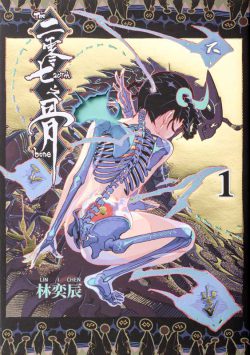
Unlike the common hot stamping process, which is typically used as partial embellishment, a large area of hot stamping is used on this book jacket to contrast the fineness of the human body and bones with the fineness of the human body. Due to its strong reflection effect, the book jacket can provide a variety of appearances when viewed from different environments and light sources. An extra bone pierces through the human body, using a hollow method to increase the sense of hierarchy, and to make readers want to take off their book jackets to peek at the book cover.
On the cover of this book is a drawing of what appears to be a bone transformed into a bone sword. Blacking out the three sides helps break the book out of its existing image, making it more like a mysterious black box waiting for readers to open up.
By means of light transmission, a baby Death on the catalog page can appear in the womb. The book’s stamp and author’s seal are affixed on the copyright page, indicating independent publication, and each book is mailed to readers by the author himself, who is responsible for the publication of the book.
Author:LIN I-CHEN
Editor:LIN I-CHEN
Illustrator / Photographer:LIN I-CHEN
W x H cm/pages:21×14.8cm/208
ISBN:9786260101619
Contact:LIN I-CHEN
E-mail:eat0123@gmail.com
SOYET PUBLISHING
Design Concept:
1. The size of the works is 29.5cm✕40.5cm, which is closed to the size of the original paintings. The paintings are presented in detail, and the details are astonishing. The author’s precise ecological observation and excellent artistic presentation ability are vividly displayed on the paper.
2. The works are printed in high quality 160lb tulip paper, which is impermeable and never deteriorates, and will be treasured and handed down forever.
3. We paid special attention to the quality of printing and binding, ensuring accurate color separation and consistent tone. The entire book can be flattened widely and read comfortably.

YANG YA-TANG
Author:HO HWA-JEN
Editor:FU YUE-AN
Illustrator / Photographer:HO HWA-JEN
W x H cm/pages:L44.5x W31x H6.5cm(boxed)/246
ISBN:9786267118153
Contact:Rose Tai
E-mail:rosetai@morningnet.com.tw


