Gold Medal

The Axis of the Spine

Hsiayu - Alibi Studio

Design Concept:
In 2009, Hsiayu set out on the Routes of Santiago de Compostela, stretching from France to Spain, and took 5 months to slowly travel 1600km by foot as a non-pilgrim. Upon arrival, she burned down her belongings and hundreds of sentences as a “ritual for rebirth”. Settling down and contemplating over the next decade, she retrieved and recreated the lines from memory to compile 33 poems into “The Axis of the Spine”.

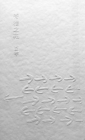
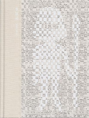
The design concept is derived from antique typography, melting lead with intense heat to create two thousand characters, which were stamped on paper, presenting one poem per page. Then, printing plates are moulded accordingly, and used to emboss words onto paper to form word reliefs of the poems.

For an easier read, an 8-page postscript is printed in black on translucent sheets; the ink is translating the word reliefs word by word. There are suggestive cut lines to tear the pages out after reading, so the readers can take part in realizing the concept-“a book with no ink”.

The heavy lead types signify solid steps. Traces disappeared on the barren lands, but the poems mark what’s left behind. Manifested in hieroglyphic characters, the poems word reliefs of the poems.show figurative beauty on the embossed side, and mirrored beauty on the debossed side. Through various complex procedures, the book is perfected by the unification of its form and its content.

The word reliefs might be eroded from the humidity and dust in the air as time goes by, but will the poems be gone in the decades to come?

Designer

Hsiayu

Designer

Yichi HONG

Author:Hsiayu
Illustrator:Hsiayu
W x H cm/pages:13cmx21cm/121
ISBN:9789574373383
Contact:Hsiayu
E-mail:pinknoise99@gmail.com

Silver Medal

Papercut Field: An Experimental Project in Taiwan

Jam WU

Design Concept:
Papercut Field is a project that was initiated in 2016 by Jam Wu, with the core members of the project consisting of 20 women and their family members from the Salty Zone in Tainan. With papercut art as the foundation, workshops are held regularly and interactions engaged in with different communities, including inviting schools and families in remote areas to take part in the project; displaying the papercut artworks in public spaces; documenting the project with Taiwanese poetry; creating innovative seasonal recipes inspired by the region; corporal performances, and other creative possibilities. The objective is to create an experimental project in Taiwan with papercut serving as the medium.

This book includes three years of works in the form of an archive. The cover uses the green-grained paper commonly found in old paper shops in Taiwan with the image of “scraps from papercut”. The spine of the book is printed with labels generally used in library, which established both vintage and contemporary mood.

The inner pages made out of paper with mundane color, imitating Taiwan traditional advertising poster, and printed with 13 Pantone colors. The small book format aimed to maintain the thick, fine, and simple atmosphere. The copyright page is finished with a bookplate cut by the papercut artists.

An effort for effortless design. Keep it simple and day-to-day.

Designer

Yi-Chiau KUO

Author:Jam WU
Illustrator:Jam WU, Hao-Chiang CHIEN, Kofu LIN, Rich Matheson
W x H cm/pages:13×18.3cm/348
ISBN:9789574368570
Contact:Jam WU
E-mail:jenselboy@gmail.com

Bronze Medal

Passers-by of Hundreds of Generations

FLiPER Creative Inc.

Design Concept:
The book is structured chronologically. The creatures were chosen from allusions of the solar terms which have been endowed with rich culture accumulated; therefore, the form of “”painting within a painting”” was born.

Binding: After printing, the paper is sorted by hand and bound in order. The book is then hand glued with PUR adhesive and pasted with front and back covers. As the process is quite complex, handwritten serial numbers are added on the back cover to provide a touch of warmth and emotional value.

Paper selection: White paper is bound to turn yellow through the years, just as wrinkles climb onto face. These are evidences of the passage of time and passing travelers of this era. Perhaps one day, when readers pick up the book again, they would find it as intimate as an old friend, with age leaving traces on both of them.

Reading experience: The cover, with its vast sea of silver stars, echoes the sense of time and space showcased in the book’s title, leading the readers into a series of stories about solar terms. With its characteristic that allows a clear view from close-up and a blurry ink-wash view from afar, the tracing paper gives a sense of heaviness to the text printed on it and a sense of lightness to images thereon. This enables readers to enjoy reading the text and viewing the images simultaneously. Finally, the symbols of each solar term are outlined in a minimalist style, so that the concept of solar terms may be illustrated visually via graphics.

Designer

Guan-Ru CHEN

Author:Guan-Ru CHEN
Illustrator:Guan-Ru CHEN
W x H cm/pages:38×29.5cm/56
ISBN:9789869206686
Contact:Chia-Ming CHANG
E-mail:rasiel@flipermag.com

Honorary Award

Swarms of Bees with no Honey

Chi Ming Publishing Company

Design Concept:
In “Swarms of Bees with no Honey”, Shang-Wei Sung explores problems in modern society and the struggles suffering by youth of this generation. Through the portraits of personal experience, he constructs the whole atmosphere of the time. The cover illustration plays around the title of the book through an nonorganic, geometrical approach, showing a sense of desire to get closer while keeping a certain distance. In printing, the deliberate overlapping of spot colors attempts to resonate with the complexity and ambiguity of modern relationship, one of the main topic of the book.

Designer

Jui-Che WU

Designer

Chia-Jung CHANG

Author:Shang-Wei SUNG
Illustrator:Jui-Che WU
W x H cm/pages:12.8 x 18.8cm/232
ISBN:9789869759274
Contact:Sheng-Hsiu Lin
E-mail:shenghsiu@chimingpublishing.com

Honorary Award

CITY#TAIPEI COLOR PROJECT

De Hsiao Co.

Design Concept:
The designer combines the three colors picked by the Pantone Color Institute for the Taipei City — timeless gray, vibrant pink and revitalizing green—with the 11 artists’ creative artworks and their living sceneries to present the city that feels both familiar and a little strange at the same time and embodies the lives in it in the modern days. On the pages of each artist, the designer compliments their works with one sentence they want to say to the city, and marks the neighborhoods they live in, the dates of the creation and the local weathers to communicate how the everyday life in Taipei permeates into the artists’ creations and emotions. Just as people are used to reading short or incomplete sentences in the sporadic free moments on their tight schedules nowadays, the designer spreads paragraphs of the writer’s articles among all the pages of the other artists so that the fragmented sentences and phrases echo with other artworks to reproduce the reading patterns of the contemporary time. Those words, sometimes straightforward and sometimes sentimental, interact with different forms of arts and reveal the Taipei City in its unique and modern faces.

Designer

Fritz LEE

Author:Fritz LEE
Illustrator:Daniel HSIAO
W x H cm/pages:18.5x2cm/96
ISBN:9789869857604
Contact:Daniel HSIAO
E-mail:fritzlee003@gmail.com

Honorary Award

A Day of the Sea

Locus Publishing Company

Design Concept:
This book is based on its author HOM’s trips to Orchid Island, the Matsu Islands, and Keelung City, three places by the sea. During his stays there, he made daily records of the sea’s ever-changing sceneries through observation and photography, and carefully depicted the deeply intricate and rich seascapes and landscapes, using steady, soft, quiet colors and brushwork. The cover’s main visual is HOM’s rendition of Dongju Island in the Matsu Islands, as he captured the instant when the sunset colors the sky and the sea. From the top of the fantasy-like pastel sky, lit in multicolor lights and specked with clouds, to the bottom where ripples on the darkening sea outline the last gleams of sunlight, HOM uses the magical moment of the evening as a tribute to the sea. The minimalist white background framing the picture and the title thinly handwritten in slightly childlike characters, symbolize how one recovers their original simplicity and feels great reverence for Nature, when faced with the sea’s beauty.

Designer

Yu-Fong LIN

Designer

Chih-Hung HSU(HOM)

Author:Chih-Hung HSU(HOM)
Illustrator:Chih-Hung HSU
W x H cm/pages:17x 23cm/136
ISBN:9789865406790
Contact:Vinelle PAN
E-mail:vinelle@locuspublishing.com

Honorary Award

real local: Beitou and Tianmu

The Affairs Medium Ltd

Design Concept:
real local: Beitou and Tianmu bears the fruit of my continuous efforts for the community I represent.

Beitou is rich in character. Its offer ranges from natural resources to agricultural products. It celebrates the legacy and culture of hot-springs and so much more. All of these distinct features have shaped Beitou into a unique district that differentiates from the urban jungles of downtown Taipei. Beitou acts as a brilliant case study that manifests the vivid fabric and dynamics that Taiwan’s civic society has to contribute.

Tianmu, on the other hand, never disappoints with its exoticism. As the community with the highest level of internationalization in Taipei, its personality stands loud and clear. It is story-filled with heritage and tales from the previous military presence of American soldiers to its current life as the hub where American and Japanese international schools thrive.

The editorial process of real local was a journey for me to rediscover Beitou and Tianmu. My 15 years of public service culminated in the making of this book. It not only fulfilled my long-time wish to dedicate a publication for my districts but also captured the exuberant talents and tales I have encountered during my service. We shot for the star and hoped that this could formulate a roadmap that brings together grassroot synergy and consolidates local cultural identity via our efforts of community mapping and knowledge production.

Designer

Chung-Yi YEH

Designer

One-Jin LAI

Author:Szu-Yao WU
Illustrator:Jean ZHAN
W x H cm/pages:21×28 cm/288
ISBN:9789869765466
Contact:Szu-Yao Wu
E-mail:wsy101158014@gmail.com

Honorary Award

DEEPER BLUE

Yashin

Design Concept:
The cover design, binding and layout was made by illustrator, Yashin. Using accordion folds and double spread illustrations to expand the visual tension. Silver ink printing on the black card as you see between pages, are aiming to reproduce the elegant textures of traditional intaglio printing, also as a respond to the exquisite emotions of the story.

Designer

Yashin

Author:Yashin, Howard YANG
Illustrator:Yashin
W x H cm/pages:13.5×20.5cm/32
ISBN:9789574371402
Contact:Yashin
E-mail:yayashin1990@gmail.com

Honorary Award

Songs and Bonfires - Jam Wu’s Solo Exhibition

Liana Gallery

Design Concept:
This is a catalog of artist Jam Wu’s solo exhibition. Several works in the exhibition were old documents been cut into thin strips, and then re-made into works by hand weaving. The design of this book uses the elements of weaving. The interlaced text effect on the cover is made on computer. The height difference is created by debossing technique for been simulated as a woven feeling; the human shape is fulfilled by 2 times white hot stamping processes, and with different pressures of debossing and white hot stamping, the multi-layer effect has been accomplished. These post-press finishing are made in larger size, and then cut to finished size for final binding processing. The design of the inner page responds to the style of the artist’s work. Three types of light coated paper are selected for full color printing and two types of tracing paper are used as interleave to distinguish each series of works.

From the paper choosing to post-press finishing and binding, this book seeks to present the characteristics of the exhibition’s focus on folk art history and Austronesian culture.

Designer

Ming-Wei LIU

Author:Jam WU
Illustrator:Chi-Hung CHU
W x H cm/pages:21x28cm/284
ISBN:9789869720014
Contact:Jam WU
E-mail:jenselboy@gmail.com

Honorary Award

Island Tales: Taiwan and Australia | Taipei←→Perth

Taipei Fine Arts Museum

Design Concept:
The exhibition catalogue is a crystallization of the artistic exchange between Perth and Taipei over the past 20 years. The inverted arrangement of the bottom of the book cover directly signifies the two different cultures and visual perspectives from the Northern and Southern Hemispheres. The book breaks the conventional order of covers and book bottoms, so that the beginning and ending are determined by which city and which direction the reader chooses. “Island Tales” are stories in which artists use words as their medium to convey their history, land and culture. If we consider the book cover design, at first glance the white land mass in the center of the image seems to be a new island that is unfamiliar and has yet to be explored. However, looked at from a different angle, if the black ocean along the coastline of northeast Taiwan and southwest Australia is taken as the main figure of the image, then the ocean becomes a solid land representing the invisible connection between the two cities. The book’s black centerfold continues the visual image of the black ocean, joining Taiwan and Australia together. The contrast between black and white and the bidirectional reading structure endows the reader with the right to decide the reading perspective. The reader can choose whether white or black is the land, or whether to begin this journey of fiction in Taipei or in Perth.

Designer

Ming-Wei LIU

Author:All artists and authors in “Island Tales: Taiwan and Australia | Taipei←→Perth” exhibition
W x H cm/pages:24.5x18cm/195
ISBN:9789865412623
Contact:Cheng-Yi CHIEN
E-mail:chengyi@tfam.gov.tw

Honorary Award

Lunatic is the Night

Dark Eyes Ltd.,

Slowork Publishing Ltd.

Design Concept:
“Lunatic is the Night” was originally a theatrical performance, fragments of which were later presented in an exhibition. It has come a long way to be published as comics, transcending the collection of truth and falsity, time and space.

Conceptually, the book cover design features caltrops, which are prevalent in Jing-Mei White Terror Memorial Park. The wiring caltrops create a nightmare, from which the victims are hard to wake up throughout their life. The cover reveals only half a body, with the other half placed in the unknown. The paper on the cover looks like bloody gauze, imprisoning the creators’ interpretation. In the world, there are still many hands fastened back with cable ties. To open the book, the readers are expected to cut the bondage at the same time (the book is wrapped with a black cable tie), so the free will is made to exist in various forms at dawn.

The layout of the pages is relatively simple. It can’t be too fancy to steal the focus of the comics. To extend the aura of the cover, the title page visually impresses the readers with strong red and black colors. The following front page with poems is changed into pure white, as a transition to take a breath before entering the realm of comics.

Designer

Yang-Hsi HSIAO

Designer

Zora WU

Author:Pao-Yen DING, Yao-Ching TSENG, A Ray, Croter, Che CHEN
W x H cm/pages:18x26cm/142
ISBN:9789866359798
Contact:Sandy CHEN; Pei-Shan HUANG
E-mail:Darkeyeslab@gmail.com ; Contact@sloworkpublishing.com

Honorary Award

The Turtle and Falsetto

pon ding

Design Concept:
The artist’s paintings bring calmness, warmth, and a knowing smile, making people want to stay with the work for a long while and look at the details of the work.

Details in artist’s daily life is the inspiration of his works. We hope that the cover would be quiet and soft to guide readers to a calm state of mind.

The book jacket funtions as a container. It intends for readers to feel the changes in the texture of paper and the details of it. While they gently lift the cover and at the same time notice the light-transmitting cover, they would feel soft in inner heart. With this emotion, readers lift the curtain and enter into the artist’s works.

As to the production, a small window was opened on the cover, and the PACHICA paper will be affixed to the inner book jacket. When the book jacket is lifted, there will be a penetrating effect through the colorless paintings, which arouses readers’ curiosity and invites them into artist’s paintings.

Designer

Yu-Jui PENG

Designer

Jui-I HUANG

Author:Anteng TSAI
W x H cm/pages:22.5×22.5cm/72
ISBN:9789869862806
Contact:pon ding
E-mail:hello@pon-ding.com

Honorary Award

The Bowl of Enlightenment

Vima House Co., Ltd.

Design Concept:
A book is a bowl; one sound is all; emptiness tolerates everything.

Starting from a piece of copper, the singing bowl makers hit the metal to convey the sound from the earth through singing bowls. The copper sheet on the book cover is the beginning of the sound. There is a Chinese character “heart” written by Mr. Tsang Man-tung on the back of the copper sheet. He wrote three thousand times of the Chinese character “heart” in IBS temple. All these copper sheets have become an installation art, “Writing Heart, Hiding Heart, Easing Heart.” Some people were invited to complete the installation art together. They took the copper sheets, put them in every nook and corner of IBS temple and gave their blessings to them. The copper sheets have exposed to sun, rain and wind, hence the traces of time. The traces are just like the proof of the durability in the long history of the copper. The color on each copper sheet is different; however, the heart in it is same. Sun, ripple, lotus, breath, the Earth and silence revealed one by one when you open the book. There is only a hollow circle on the book cover and you’ll see the circle become bigger and bigger when you open the book. The copper sheet behind the cover and the first few pages also become bigger and bigger when you open the book and turn the pages. It symbolizes the resonance of the sound; it is also the ripple of water. Both of them nurture our sun, our earth and our universe. It is the entrance of silence.

Designer

Yu-Jui PENG

Designer

Jui-I HUANG

Author:Man-Tung TSANG
Illustrator:Man-Tung TSANG
W x H cm/pages:17x24cm/176
ISBN:9789868976856
Contact:Hui-Chen YEH
E-mail:ibsvima01@gmail.com