Winning Books
Gold Medal
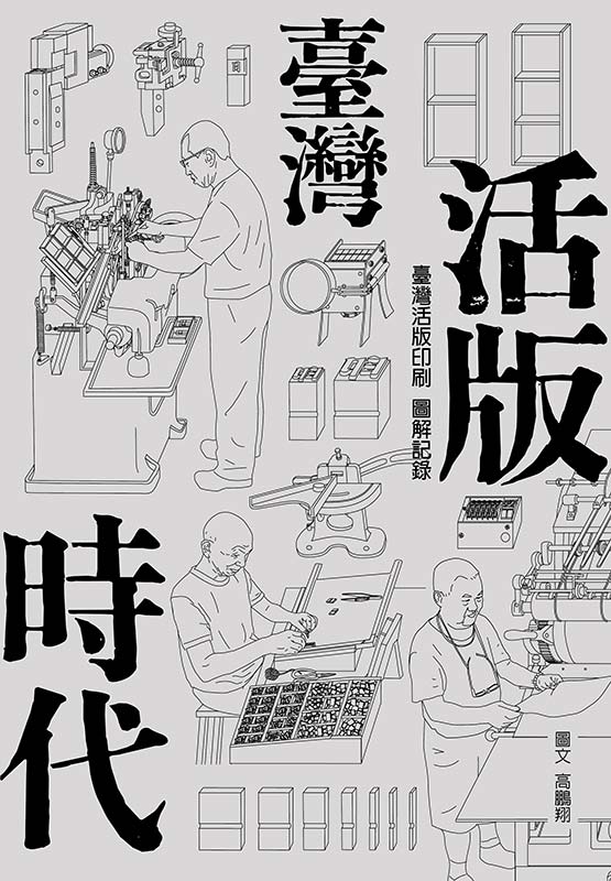
《The Visual Guide to Taiwan Letterpress Printing》
Binding & Design Concept:
The design draws inspiration from the era of letterpress printing, using the soft grey of lead type as the book’s main visual tone. This grey carries through both the cover and the interior pages. For the cover and chapter titles, we used Ming movable type in its original size to highlight the beauty of traditional metal type.
The book uses an exposed-spine binding, and the front and back covers open out to form one continuous image. The illustration shows the key steps of letterpress printing—type casting, sorting, typesetting, and printing—so readers can truly get a feel for a working letterpress studio.
The cover was printed using traditional letterpress techniques, with four passes and three levels of impression, making the images and text’s texture and depth stand out distinctly.
Illustration Approach
The illustrations depict the process of letterpress printing, from the individual tools and steps of casting, sorting, typesetting, and printing. All elements are shown from a flat, horizontal angle that best explains how they work. The result is a calm, easy-to-follow flow across the pages.
To keep the visual style consistent, later illustrations often went back and refined earlier ones. It was a detailed, step-by-step process that really shows the care and skill behind letterpress printing.
Jury comment:
With exquisite hand-drawn illustrations, the process and memories of Taiwan’s letterpress printing are reconstructed in this book by Peng Hsiang Kao. The author spent five years on his own, visiting all the type casting and printing plate shops in Taiwan. He personally interviewed, documented and drew hundreds of pictures depicting printing techniques and site details to recreate the skills, presence and touches of seasoned craftsmen. The binding design echoes the features of letterpress printing by using a refined paper texture, calm color and blank space in the layout to accentuate the “slow and steady” spirit of craftsmanship. It is as if readers can feel the types, character plates and the weight of the machines.
The core concept of the cover comes from the craftsmen’s perspective, emphasizing the beauty of the workers, their tools and equipment. The pages inside recount through both macro history and micro technology, so that readers can understand the cultural context of letterpress printing as well as examine the focus and heritage behind each step. This book is not only a record of the printing craft but also the act of preserving a fading industrial culture through design. Its binding is precise, poised and emotional, presenting praiseworthy proof of the creator’s passion, professionalism and persistence.

KAO, PENG-HSIANG
Author:KAO, PENG-HSIANG
Editor:HUANG, YU-CHING
W x H cm/pages:18x26cm/144
ISBN:978-626-418104-4
Silver Medal
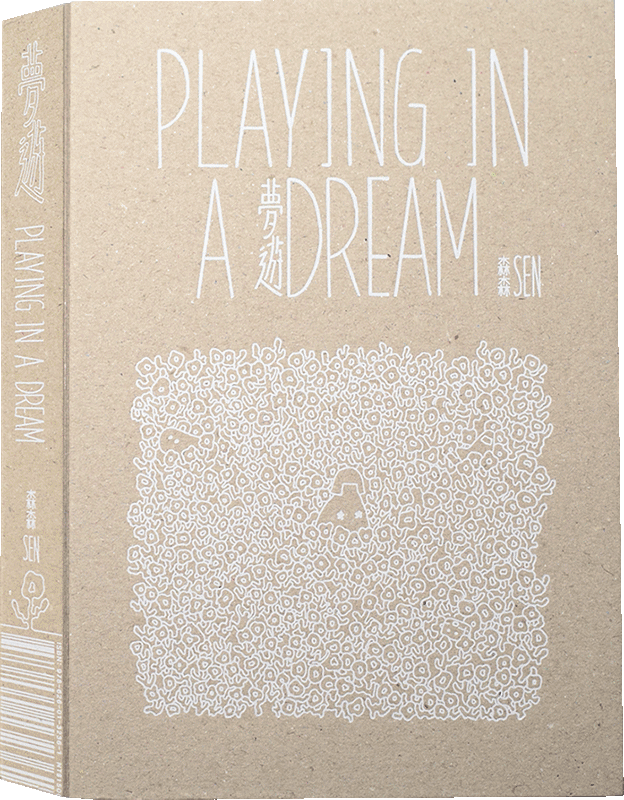
《Playing In A Dream》
Sen
Binding & Design Concept:
Using the childhood audiobook as a core design concept, Playing in a Dream brings together comic, audio, and book design—integrating these elements into a single cohesive work.
Within the comic, the use of mirrored scenes and life trajectories echoes the A/B sides of a cassette and the nature of magnetic tape. On the reverse side of the front cover, a built-in slot holds the cassette, adding functionality without disrupting the reading experience.
Inside the pages, a mini diary is attached at a specific scene, allowing readers to either organically engage with it or simply pass over it. This not only creates the sensation of reading a book within a book, but also invites readers to connect their own reality with the paths the story opens.
Jury comment:
Written and illustrated by Sen, Playing In A Dream is a multimedia comic work in which the design of the book itself is a part of its narrative. A cassette tape sits in the slot on the back cover that intends to include, instead of attach, the audio as a part of the extensive reading experience. The pages inside braid three-color Riso-printed fantasy-like comic scenes, handwritten strokes and a glued-in diary booklet into a three-dimensional dream that can be felt, listened to, flipped and read. The binding skillfully harmonizes different media into one book, balancing craftsmanship and a handmade touch. As readers turn the pages, they are transported to and fro between reality and reverie. The opening and closing of the book, the texture of the paper and the chromatic overlap all echo the theme of dream, memory and sound. In addition to the content, the entire design of the book becomes a part of the story—a storybook that is heard, a space where still pages stream sound and imagination.
Sen
Author:Sen
Editor:Suwei
W x H cm/pages:13×18.7×2.8cm/88
ISBN:978-626-01-3236-1
Bronze Medal
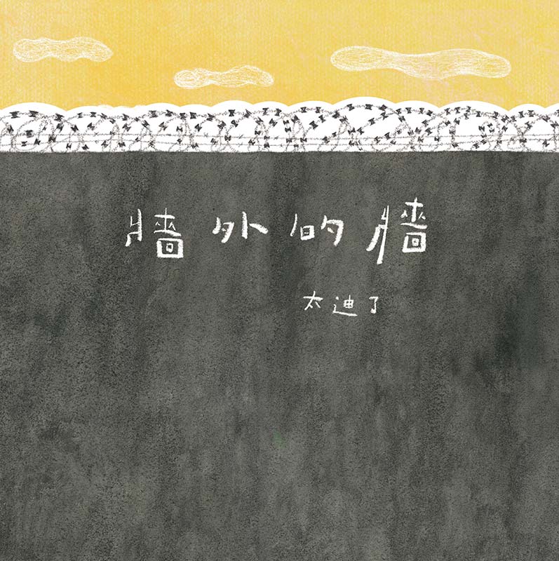
《Endless Walls》
Diancan Art and Collection Ltd.
Binding & Design Concept:
Author:
In this story, the sky not only symbolizes freedom but also forms the shared landscape that connects the girl and her mother—an in-between space where reality meets imagination. The dust jacket is the reader’s very first point of contact, and I wanted to use an unmissable high wall to conceal the sky the girl longs for every waking moment. I hope this design sparks readers’ curiosity about the hidden scenery, leading them to open the jacket, turn the pages, and step into the story themselves.
As we walk through room after room enclosed by walls, then open door after door toward understanding and gently step back out again, perhaps we might notice the sky above us at this very moment. I hope the cover and dust jacket echo the relationship between the walls and the sky in the story and hint at the philosophy and emotions embedded within.
On the top left of the back cover is an extended visual question about what is real and what is not—is the sky real, or merely a painting? Only those who look closely will discover the answer.
Designer:
The change of typeface within the text reflects a turning point in the story and symbolizes a shift in focus—from a single character to expectations placed upon society. The towering wall-shaped dust jacket wraps around a cover that looks entirely different, and together they form the story’s formal introduction. Once the jacket is removed, what appears underneath is a world shaped by the author’s heartfelt emotions.
Jury comment:
The cover of this book is wrapped in another layer of paper that makes up a tall black wall with barbed wires on top. The wall blocks an open, beautiful view. This plain structure walls in and out two different sceneries that also reflect the polar opposites of confinement and freedom explored in the story.
This is a picture book which tells the moral of the story through concise language and meaningful illustrations. It defines what the wall means in different times and circumstances, drawing readers into the rhythm of the story.
Without elaborate processing methods, the book comprises only basic binding and paper material. It exudes a unique warmth through its simple yet direct thought behind the design and delicate narrative.

Honor Award
《The White Witch》
HAN LIN PUBLISHING CO., LTD.
Binding & Design Concept:
The cover of this picture book has a cut-out that lets you peek at the main character’s face! Around it, there are little drawings of sewing tools and threads, making it look fun and handmade. Before you even start reading, you can guess what the character looks like and what they like to do, which makes you curious and excited to open the book and see the story inside.
The pages inside the picture book are drawn in a doodle style that kids love, with soft, pastel colors to create a warm and friendly feeling. The book also cleverly uses transparent cellophane sheets, so children can interact and explore as they turn the pages. By combining sights and touch, it encourages young readers to read actively and enjoy learning.
Jury comment:
Even before readers open the book, they are greeted by the protagonist through the carved-out book cover that is delicately designed. The space carved out shows the face of the White Witch. Along with elements such as fabric and stitching, a handmade and childlike charm is created to not only spark children’s curiosity but also appeal to parents at first sight with gentle and thoughtful care. The artwork inside mainly applies a doodle style aimed at attracting children’s attention. The designer uses a pastel color palette to build an inclusive and compassionate environment for reading. Adding elements like transparent sheets to play with provides an interactive reading experience in which children can explore, move and compare. The goal is to allow them to “play while reading and read while playing.”
The story is about the encounter of the White Witch and the Motley Witch through colors. Their exchanges and sharing in each other’s company gradually paint the White Witch’s originally monochromatic world into a colorful one. This shift represents more than just a change of colors; it symbolizes the acceptance of differences as well as the heartwarming power of friendship and understanding. The story, images and physical engagement blend together seamlessly in an organic way. This valuable piece of work offers aesthetical enlightenment and emotional education that encourage active participation from children, making it worthy of recognition and recommendation.


Honor Award
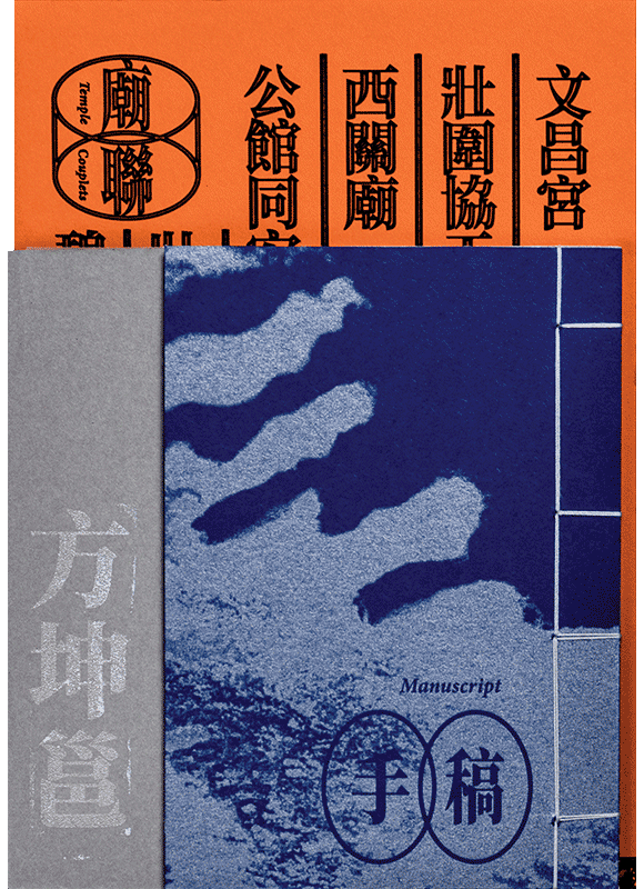
《FANG Kun-Yung’s Yilan Temple Couplets》
Kyo Hsieh
Binding & Design Concept:
Fang Kun-Yung, the author’s grandfather, left behind a trove of manuscripts that came to light as the author sorted through his archival materials. Among them was a collection of temple couplets—poetic inscriptions traditionally carved or painted on the pillars and doorways of Chinese temples. To trace the connections among the poetry, the temples, and his own family, the author later visited these sites in person, documenting the couplets that have survived for more than thirty years.
FANG Kun-Yung’s Yilan Temple Couplets comprises two volumes: one a photographic record of local temples, the other a compilation of Fang’s handwritten drafts. Together, they reveal the interplay between classical Chinese literary aesthetics and Taoist belief.
What makes this set distinctive is its dual design inspired by the reading habits of traditional Chinese scholars. The right-hand volume, larger in format, follows the traditional right-to-left reading order, echoing both the physical experience of viewing temple inscriptions and the way a scholar might jot down notes with the right hand while reading. The left-hand volume adopts the thread-bound style of classical Chinese books, complete with a traditional blue cover, faithfully recreating Fang Kun-Yung’s manuscripts. This design not only reflects historical habits of writing and reading but also creates a dialogue between past and present.
Jury comment:
The objective of this book design is to display both the traditional and contemporary that exist in Taiwan’s traditional temple culture. It is an exceptional effort to systematically restructure extensive literature within a highly organized information framework. With the help of even spacing, blank spaces and textual flow, the couplets arrangement reach a triple effect of being “readable, credible and enjoyable.” The massive amount of information is designed with precision so that readers can effortlessly digest the writing of traditional culture. This is an excellent publication worth collecting as it preserves cultural depth. It brushes out the beauty of traditional temples, recollecting cultural memories.

Honor Award
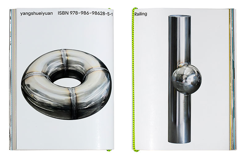
《Railing》
pon ding
Binding & Design Concept:
The book design of Railing centers on the concept of “design as process,” transforming street observations and craft explorations into an object that can be physically unfolded, layer by layer. The cover adopts a glossy metallic texture, symbolizing the sheen and solidity of universal spherical joints, while its intentionally “unfinished” appearance reflects the designer’s belief that the process holds more meaning and excitement than the final outcome.
Inside, a diverse selection of paper—glossy, rough, translucent, and colored—creates a tactile and visual rhythm, guiding readers through a sequence of sensations that mirror the designer’s creative journey: from finding inspiration on the street, to experimenting in workshops, to shaping the final piece. Each chapter introduces a new lens of observation, connecting sketches, fabrication methods, and philosophical reflections into a continuous narrative of design thinking.
Balancing between a “casual street spirit” and the refinement of crafted precision, Railing transcends the definition of a design publication. It is itself a crafted artifact—an experiential object inviting touch, discovery, and interaction. Through reading, the audience is not merely observing design but participating in an ongoing act of rediscovering everyday craftsmanship, where each page turn becomes part of the design process itself.
Jury comment:
This book combines sheets of paper made of different textures and qualities. The cover design features the extreme closeup of a metal railing against a clean white backdrop. The title is positioned in the corner in a small font. The contrasting visuals of the extremely large and small demonstrate the minimalist style unique to industrial design. As an industrial designer, the author presents a series of imaginations of the versatile ball joints in public railing systems with which people in Taiwan are familiar.
There is no specific form or framework for the layout of the texts and images on the pages inside. The content looks more like organized thoughts spontaneously spread throughout in the book to share with the readers. The creative ideas appear on varied paper textures, making the book look like an interesting and playful designer’s journal.
Honor Award
《You Walk in the Wind》
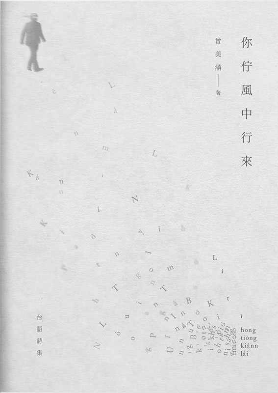
Chiu Ko Publishing Co., Ltd.
Binding & Design Concept:
The book draws from a moment in 2016, during former president Tsai Ing-wen’s inauguration, when Cheng Nan-jung’s portrait slowly came into view in the distance.Centering on Cheng Nan-jung, the collection traces stories of White Terror victims and key moments in Taiwan’s journey toward democracy. The cover design reflects this historical weight through a minimal yet layered approach: a translucent outer sleeve evokes a veil of mist over the past, while the inner layer reveals names of White Terror victims—rendered in Romanized Taiwanese—scattered like windblown memories. At the edge of this wind, a faint silhouette of Cheng Nan-jung walks forward, his protest unwavering.
Jury comment:
The book cover wears a matte tracing paper as its jacket so its image can be subtly seen through the low opacity, creating a blurring effect. The letters on the cover are designed to be scattered as if the wind had swept them away. The tracing paper draping over the cover adds to the obscure impression of the scattered letters blowing in the wind. This choice in design outlines the book’s concept to be more expressive and profound.
Besides pairing the graphic design with proper printing paper, the key role in the final presentation of the book design is how the transparent essence of the tracing paper was employed. In this era where published works are becoming digitized, this design underscores the irreplaceable qualities and sentiment of physical publications.

Honor Award
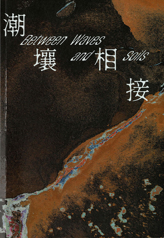
《Between Waves and Soils》
Kaohsiung Museum of Fine Arts
Binding & Design Concept:
The exhibition Shorelines in Flux centers on the ever-shifting boundary between water and land.
By tracing the continual transformations of this liminal zone, the exhibition opens up discussions on the ownership of natural resources and the resulting issues of soil degradation, interethnic tension, cultural continuity, and environmental preservation. Through this lens, the Kaohsiung Museum of Fine Arts extends its long-standing engagement with ocean-related concerns and the broader perspectives of the “Global South.”
Visually, the design draws from the textural qualities of radiographic imagery, evoking a material condition where soil and liquid intermix, permeate, and seep into one another. Dispersed typographic arrangements appear across printed materials of various scales throughout the exhibition, creating a rhythm of fragmented information. The use of dual-tone gradients references the two elemental substances, forming a sense of fluid scanning—movements that resemble tidal oscillations or currents slipping through the lines of a scanner. This dual motion ultimately articulates the exhibition’s layered, tidal sensibility.
Jury comment:
Between Waves and Soils is a close-fitting grasp of the multilayer structure and visual concept. Its cover is composed of color blocks that symbolize strata, tides and land sedimentation to convey an “ecological perception.” The editorial design of the content takes advantage of fluid layouts and blank spaces to change the pace of reading, striking a neat balance between text and image. This book stands as a successful case where the concept of curation marries well with publishing aesthetics. As a result, the highly dense information creates a deep, rhythmic and story-driven reading experience.
Honor Award
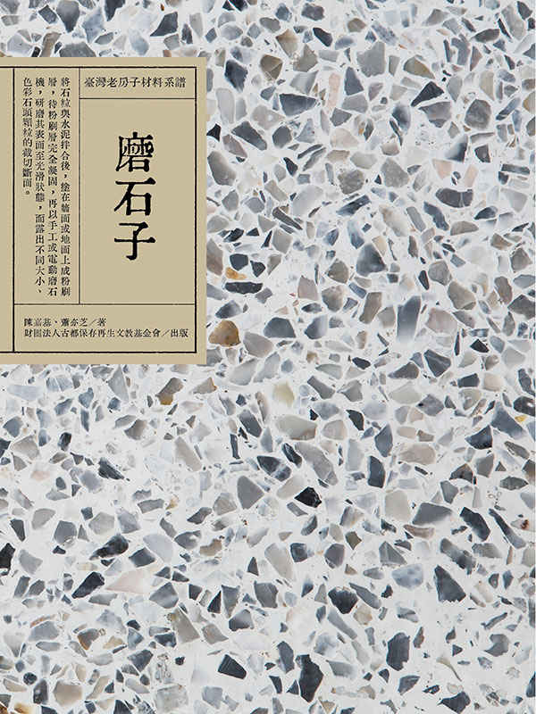
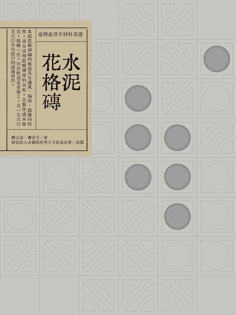
《The Materials that Built Modern Taiwan: Craft, Culture, and the Architecture of Everyday Life (Terrazzo / Breeze Blocks)》
Foundation of Historic City Conservation and Regeneration
Binding & Design Concept:
Materials are active agents in the shaping of a place, carrying traces of climate, craft traditions, cultural habits, and the practical wisdom of daily life. This understanding forms the foundation of the book series The Materials that Built Modern Taiwan: Craft, Culture, and the Architecture of Everyday Life. The book design, in response to this premise, treats each volume as a small architectural object whose very surface speaks to the material histories explored within. Textured papers, exposed spine constructions, and carefully orchestrated material contrasts echo the tactile qualities of the elements that shaped modern Taiwan—the smooth surfaces of terrazzo and the openwork patterns of breeze blocks. These choices allow the physical book to mirror the sensorial world of the architecture it documents, while enabling readers to touch, feel, and form an intuitive bridge between the content and the lived environments it represents.
The page layout, with its clear and readable structure, reflects the author’s concise writing and rich imagery. The interplay between text and images facilitates an intuitive reading experience, layering information in a way that highlights narrative coherence and enhances the overall flow.
Jury comment:
The biggest challenge of designing this book lies in putting the complicated history of building materials down on paper. This operation requires the outstanding skills of organizing and visualizing data clearly. The visual language on the covers is shown in terrazzo and concrete breeze blocks so readers can get a feel of what the materials are like at first glance. The content in the body includes both text and image of topics ranging from construction methods, history, patterns to village projects. In this way, the transfer of knowledge becomes easier and material culture becomes more approachable, though still professional, to readers. The design of these kinds of cultural heritage books is characterized by such elegant visual organization.

Honor Award
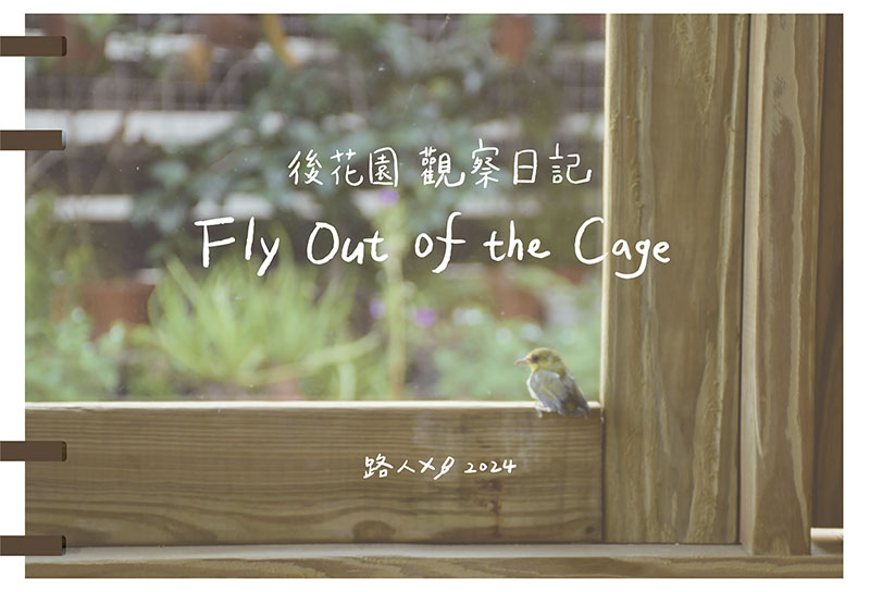
《Fly Out of the Cage》
Remainer Studio
Binding & Design Concept:
Inspired by the concept of a “glasshouse,” this book blends photography with handcrafted bookbinding to create a multi-sensory reading experience. Its exterior—constructed with acrylic and Taiwanese cypress—offers the coolness of glass and the warmth of wood, inviting readers to feel as if they are pushing open a door into the author’s private garden. Inside, photographs present the tangible world while illustrations convey imagined scenes; tracing paper is used to separate the two, generating a layered interplay between reality and imagination.
Toward the end, the design guides readers out of the glasshouse, echoing the book’s central idea of Fly Out of the Cage. Through materials, structure, and the act of turning each page, the book becomes a complete journey of entering, sensing, and ultimately letting go.
Jury comment:
Fly Out of the Cage centers on the imagery of a “glass house” and cleverly combines photography, illustration and handmade bookbinding to exhibit a work of both visual poetry and tactile warmth. The book bag and cover are created from Taiwan Cypress and acrylic, forming an object that can be “entered.” When readers touch the warmth of wood and the cold of glass, it is like pushing open a door and stepping into the author’s private garden. The choice of these materials is not merely as surface decorations but the solidification of “freedom and confinement,” calling on the readers to feel for themselves.
The structure in the pages is built by photographed records of genuine moments and illustrations to make up for the imagination that was not captured. Tracing paper is the medium between the two, through which the page-turning process forms multilayered experiences of “seeing and not seeing,” of “reality and projection.” At the end, readers are guided out of the glasshouse as a response to the title, “Fly Out of the Cage,” suggesting a relaxing and releasing state of mind.
This book weaves materials, images and reading into a complete journey of watching, feeling and comprehending. It is truly an extraordinary work where the book itself is the scene.

Honor Award
《Far Too Close (Go Too Far)》
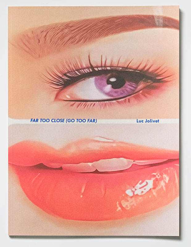
nosbooks publication ltd
Binding & Design Concept:
1. The poster book, when folded, it shows the images in details; when unfolded (48x69cm), it opens up as a whole. It’s tempting to unfold to see. On one hand, the book’s structure carries the micro- and macro- views of the photographs. One the other hand, the book’s navigation accommodates this temptation to look, to decipher, insomuch as the photographer’s speculation beneath the surface of reality.
2. The book allows readers to look closely, or from a distance. Readers can experience the photographer’s changing perspectives.
3. When posted on your wall, the mundane but extraordinary scenes in the photos are borrowed and fused into your living space – The idea of “borrowing scenery” in oriental aesthetics.
4. Readers have to tear the pages to unfold the images; but if you keep the book intact, you cannot see all the images. It could be a difficult choice in the mind, but also a very interesting physical relation between the reader and the book.
Jury comment:
The concept of Luc Jolivet’s Far Too Close (Go Too Far) centers on the “distance of watching,” capturing all the everyday oddities in Taiwan. The works zoom in and out between the microcosm and macrocosm, filled with strange senses of poetry. The large-format binding begins with a preface in three-color Risograph print to set the stage and raise questions for the chapters to come. The photobook consists of 12 detachable perforated posters in quarto fold. Each poster can be “kept folded” or “torn open” as readers choose their own pace and way of reading. When folded, the images appear detailed and intimate; when open, the images widen into panoramas, corresponding to the photographer’s gaze from near to far. The Riso-printing and folded lines carefully control the visual rhythm while the caliper and paper size ratio stress the difference between closeups and long shots. The binding is designed to be taken apart to turn a usually more passive reading experience into a more active reader participation.

Honor Award
《Close to Mountains》
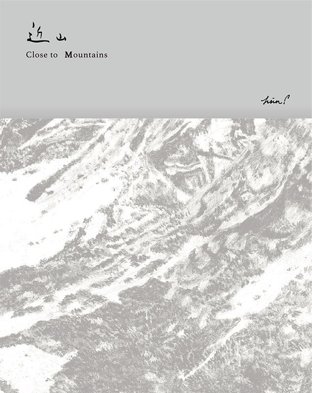
Figureboy Co., Ltd.
Binding & Design Concept:
Close to Mountains, a book that celebrates the healing nature of Taiwan’s forests and mountains, is a collection of a three-year project by the artist hsin.
With painting brushes, hsin familiarizes herself with mountains, depicting the geology, light, and climate at different altitudes, and rendering observations into paintings. As readers go through the pages, they virtually walk on mountain trails, with layers of brushstrokes and paper textures delivering a sense of tranquility that soothes them.
The chapters are arranged according to the high, middle, and low altitudes, bringing different natural environments into a coherent narrative. With the illustrations of flora and fauna and the fieldwork notes of the artist, drawings and writing complement each other. The reading experience is like a journey to the mountains that makes readers reflect the beauty of their homeland.
The book’s aspect ratio mirrors the dimensions of the original paintings, allowing the artwork to be presented as full spreads or with proper visual lacuna. On the cover, a misty silver foil subtly reveals a portion of the artist’s work Mt. Xue Cirque. Along with the rock-textured hardcover, it serves as the book’s visual prologue. For each section page, a translucent Finnish paper is stitched before an artwork page like mist in between landscapes. Every detail—from the printing and coating to the paper texture—reinforces the book’s core idea: making reading a healing experience brought by the mountains.
Jury comment:
The entire design of this book fits concept, materials and emotions together perfectly. A natural texture extends across the cover, carrying a smooth mountain contour that is expressed with embossing technique. The senses of sight and touch join to cultivate the profound “quiet of the mountains.” The pages inside hold huge blank spaces and calming colors laid out delicately. It looks as if readers are walking along the mountain trails in the artist’s heart. This mature work allows the reading process to radiate the warmth of mountains through fine pacing and subtlety.

Honor Award
《Please take your shoes off and come in》
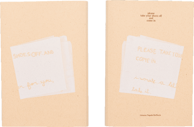
pon ding
Binding & Design Concept:
This book’s design responds to Johanna’s view on the intimate relationship between humans and nature, and to her gentle form of resistance carried out in the name of love. In its binding, the book abandons the traditional spine and instead uses grass-green saddle stitching without glue, allowing the book itself to become a soft, natural object. When reading, one can sense the subtle tension of the thread: the pages are gradually drawn toward the centre of the spread. This movement—from the outside toward the inside—echoes the visual narrative’s axis of “far — near — far”: from twigs and forests, moving closer to home and family (the co-flourishing of humans and environment), and finally returning to nature. From binding to photographs, the overall design constructs a “soft persuasion”: in the act of page-turning, the reader is guided into the harmonious coexistence between humans and nature that Johanna imagines.
Jury comment:
Please take your shoes off and come in is an autobiographical photobook by Johanna Tagada Hoffbeck. The book design itself carries emotions. The binding is composed of soft paper, low-saturation ink and an exposed spine stitched in grass-green, forming an edged curve. The warm, smooth quality of both the cover and textblock embodies the inviting tone of the title, “Please take your shoes off and come in.” There is no distinct border or a loud layout. Instead, there is a tender and modest minimalism that leaves blocks of blank space. Turning the pages feels like stepping into the artist’s home, strolling slowly through her garden amid light and shadow. The images capture details of daily life in soft focus and closeup shots, while the design strengthens these silent moments with a tranquil rhythm. The overall materiality becomes an extension of the content: soft and intimate with a strong sense of time. The book design does not serve the images but breathes with them. The whole work whispers like a poem—inviting the readers into the artist’s serene and secret world with physical touch.